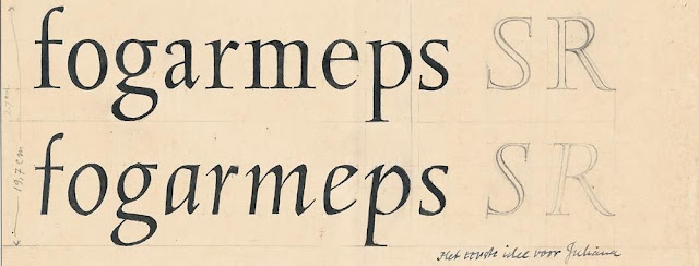
Sem Hartz & the Making of Linotype Juliana


There are few things we enjoy more than an engrossing book about Dutch type design. By the same token, there are few things more frustrating than not being able to find books published in English that deal with the work of a favourite Dutch designer. Such is the case with Sem Hartz, a gifted engraver and designer who lived—and died—under the shadow of his colleague, Jan van Krimpen. Perhaps for this reason, Hartz did not receive the critical and biographical attention one would expect of such an accomplished figure.

Frustrated by the dearth of information about Hartz in English, Inferno Press commissioned Mathieu Lommen, a curator at the Special Collections Department at the Amsterdam University Library and friend of Hartz, to write the story of the design of Linotype Juliana. Sem Hartz and the Making of Linotype Juliana is the first publication in the English language dealing exclusively with the making of this face. It is the kind of book Inferno Press was created to publish.

The text has been laser-printed on archival paper using a newly digitized version of Juliana. In fact, this is the inaugural appearance of this font, which is now commercially available from the Font Bureau. Photographic reproductions of Hartz's early drawings for Juliana are tipped in. The cover is letterpress-printed on a Nepalese Lotka paper (various colours) or on an orange Zerkall Ingres. 8 ¼ by 5 inches. 15 pages. 100 numbered copies. Stitched into soft covers. Out of print. 

Review

'For those interested in type design, and particularly those interested in the gestation of a typeface through to its commercial availability, this little vignette — just eight pages of text with three tip-in illustrations — in a format slightly larger than a paperback, provides a snapshot of the creative and mechanical processes of typefounding, that was literally in its dying days during the 1950s. This is essentially the story of Juliana, the only accomplished typeface designed by Sem Hartz, the trials and tribulations of bringing it to market, where the incredibly slow pace of seven and a half years was extreme, judged even by the archaic methods of type production just some fifty years ago. . . .'

— Reviewed by Dave Farey in Parenthesis 14, February 2008

Hand-drawn italic and roman capital letters.

Above and below: details from Sem Hartz and the Making of Linotype Juliana.

hand-drawn italic letters


hand-drawn roman and italic letters


Stanley Morison's Egg-Sandwich Exegesis

Antique font in red surrounded by black typographic ornaments

What do Stanley Morison, the Fell types, egg sandwiches, and literary hoaxes have in common? You'll find out in Stanley Morison's Egg-Sandwich Exegesis, a parody of the prose style of the twentieth century's greatest typographic historian. As you can guess from this description, the book was published for a very . . . select audience. In a fit of optimism, we printed 100 copies. For anyone who enjoys a good literary hoax and a bit of fun at a great writer's expense, this book is sure to delight.

"It is my hope that this fragment will interest typophiles, historians of the printed word as well as those with an interest in Belgian sandwich-making in the 1950s, about which subject there is still a great deal to explore." — from the Preface.

Stanley Morison's Egg-Sandwich Exegesis is set digitally in Fell types—about which Morison spent forty years researching and writing—and was printed letterpress on Mohawk paper and bound in soft covers. With an original illustration by Brent Dutton. Nine pages. 5 by 8 inches. The price is CDN$30 which includes shipping anywhere in the world. Out of print.

Review

“The pamphlet is a most entertaining parody of Morison’s rigorous researches and exacting literary style. It is also well-designed and printed. The pages — set on a computer in digitized Fell and printed letterpress from polymer plates — are well laid out with proper margins, and the presswork is very creditable. . . . Though modest in scale, Stanley Morison’s Egg-Sandwich Exegesis is a success, and bodes very well for future publications from Inferno Press.”

— Reviewed by Paul W. Nash in Parenthesis 12, November 2006.

The image above shows a page from the prospectus.


Five Poems by Constantine Cavafy with Five Wood Engravings by Peter Lazarov.


Five Cavafy poems newly translated by David Smulders and illustrated with five new wood engravings by Peter Lazarov. Shown here are two of Peter Lazarov's wood engravings from the book. Images are copyright Peter Lazarov. UPDATE: This book — including the wood engravings shown here and others — was published in different format and edition size by Barbarian Press.